Harnessing Pantone’s New York Fashion Week Spring/Summer 2022 Colour Palette

Pablo Picasso once said, “why do two colours, put one next to the other, sing? Can one really explain this?” Our fascination with colour seems to be endless and it captures the hearts and minds of people in almost every industry, but none more so than fashion and design.
To celebrate the release of Pantone’s NYFW spring/summer 2022 colour palette, we’re going all out. We want to show you how to harness this amazing palette in your home styling to achieve different effects. Why? Colour is an incredibly powerful design tool and Pantone are the experts!
Zimmerman 2021-2022 New York Fashion Week RTW by Runway Magazine
Pantone’s NYFW colour palette
“Colours for Spring 2022 bring together our competing desires for comforting familiarity and joyful adventure through a range of soothing and timeless colors, along with joyous hues that celebrate playfulness,” explains Executive Director of the Pantone Color Institute, Leatrice Eiseman.
Here’s the top 10 colours from the report for you to salivate over:
2022 core classics
As well as the bright and bold colours above, Pantone have also released five fresh takes on classic colours they believe designers will be using in their next lines.
How to incorporate the 2022 Pantone colours into your interior styling and décor
We don’t know about you, but we’re excited to start styling! Here are a few cheeky tips from us to you about how you can use Pantone’s colours around your home (and here’s a little extra info about colour psychology too if you’re curious).
Colour spotlight
Bold colours are one of the best styling tools. They can be used as décor accents or to anchor a space when they’re channeled to one big feature piece of furniture, like a couch. Warmer bold colours, like pinks and reds, are a great option for spaces where you’d like to cultivate a little extra energy, plus they’re the perfect accent colours for a neutral theme.
Our Red Ceramic Wall Hook is a stellar option for keeping your home office cords in order or for hanging pots and pans in the kitchen on display. Alternatively, if you’re chasing that Gossamer Pink colour, our Pink Sorbet Ceramic Disc Knob With Gold Rim brings a lush feminine edge to generic dressers or bedside tables.
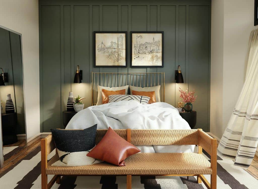
Keep it neutral
Neutral colours aren’t boring – while they may lack the brashness of bright hues, they make up for it in the elegance and finesse they offer in a variety of different spaces. We love that Pantone’s core classic colours feature a pale grey, sandy beige and basil. If you’re on a mission to upcycle, we’ve got a few ideas for you to chew on.
Contrast our Silver Iron Crown Knob with the Wedged White Marble And Wood Pull Bar to bring in a mix of warmth and coolness to your cabinetry. While they don’t have to be side by side, if they’re in close proximity – and supported by other detailing, like wooden furniture and silver dècor – your space may just start to sing ‘luxury’.
If you’re trying to create a zen wellness vibe, one of our fave combos is the Hex Green Quartz Knob and Carved White Bone Drawer Handle. Marrying the basil and sandy beige gives off a calm, tranquil energy (crystals have healing powers, you know) perfect for your living room or meditation zone.
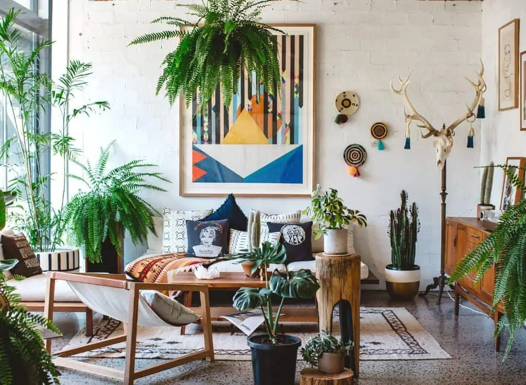
Embrace eclectic neon chaos
A final note here: don’t be afraid to experiment! Pantone’s colour palettes are meant to be mixed and matched, so you could opt to go with colours that enliven and invigorate you, like the zesty Daffodil or dramatic Poinciana.
Now that we’ve planted that seed, here are a few extraordinary Do.Up products that may compliment your next zany creation:
- Mop Spinning Wheel Knob
- Abstract Enamel Knob
- Copper Hexagon T-Bar Pull
- Green And Nougat Terrazzo Handle
- Zebra Striped Hat And Coat Hook.
Don’t be afraid to express yourself in colour!
There’s nothing we love more than seeing how you express yourself through our products. We want to see the weird, wonderful and downright wacky – so make sure you tag us on socials @do.upper so we can share in your genius. But if you’re stuck for ideas, make sure you check out our blog or shop for inspiration.








One thought on “Harnessing Pantone’s New York Fashion Week Spring/Summer 2022 Colour Palette”
Comments are closed.